Yellow-Red-Blue, 1925 by Wassily Kandinsky
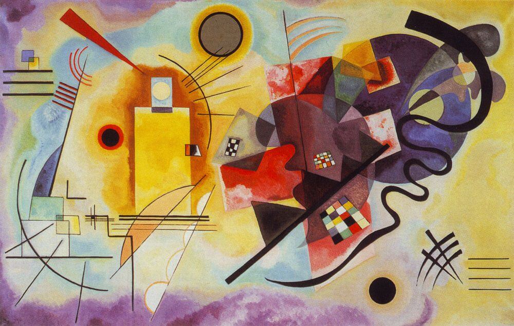
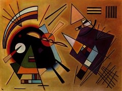
Yellow-Red-Blue was created by Wassily Kandinsky in 1925. The primary colors on the painting feature squares, circles and triangles and there are abstract shapes mixed in with these. There are also straight and curved black lines that go through the colors and shapes. This is to help provoke deep thought in the person viewing the piece.
Yellow-Red-Blue can actually be divided in half with how different each of the sides are. The left side has rectangles, squares and straight lines in bright colors while the right side features darker colors in various abstract shapes. These two sides show different influences and are meant to create varied emotions in the viewer.
In 1925, Kandinsky taught the basic design class for beginners and the course on advanced theory at the Bauhaus; he also conducted painting classes and a workshop in which he augmented his colour theory with new elements of form psychology. The development of his works on forms study, particularly on points and line forms, led to the publication of his second theoretical book (Point and Line to Plane) in 1926. Geometrical elements took on increasing importance in both his teaching and painting - particularly the circle, half-circle, the angle, straight lines and curves. This period was intensely productive. This freedom is characterised in his works by the treatment of planes rich in colours and gradations - as in Yellow-Red-Blue (1925), where Kandinsky illustrates his distance from the constructivism and suprematism movements influential at the time.
The two-meter-wide Yellow-Red-Blue consists of several main forms: a vertical yellow rectangle, an inclined red cross and a large dark blue circle; a multitude of straight (or sinuous) black lines, circular arcs, monochromatic circles and scattered, coloured checkerboards contribute to its delicate complexity. This simple visual identification of forms and the main coloured masses present on the canvas is only a first approach to the inner reality of the work, whose appreciation necessitates deeper observation - not only of forms and colours involved in the painting but their relationship, their absolute and relative positions on the canvas and their harmony.

